
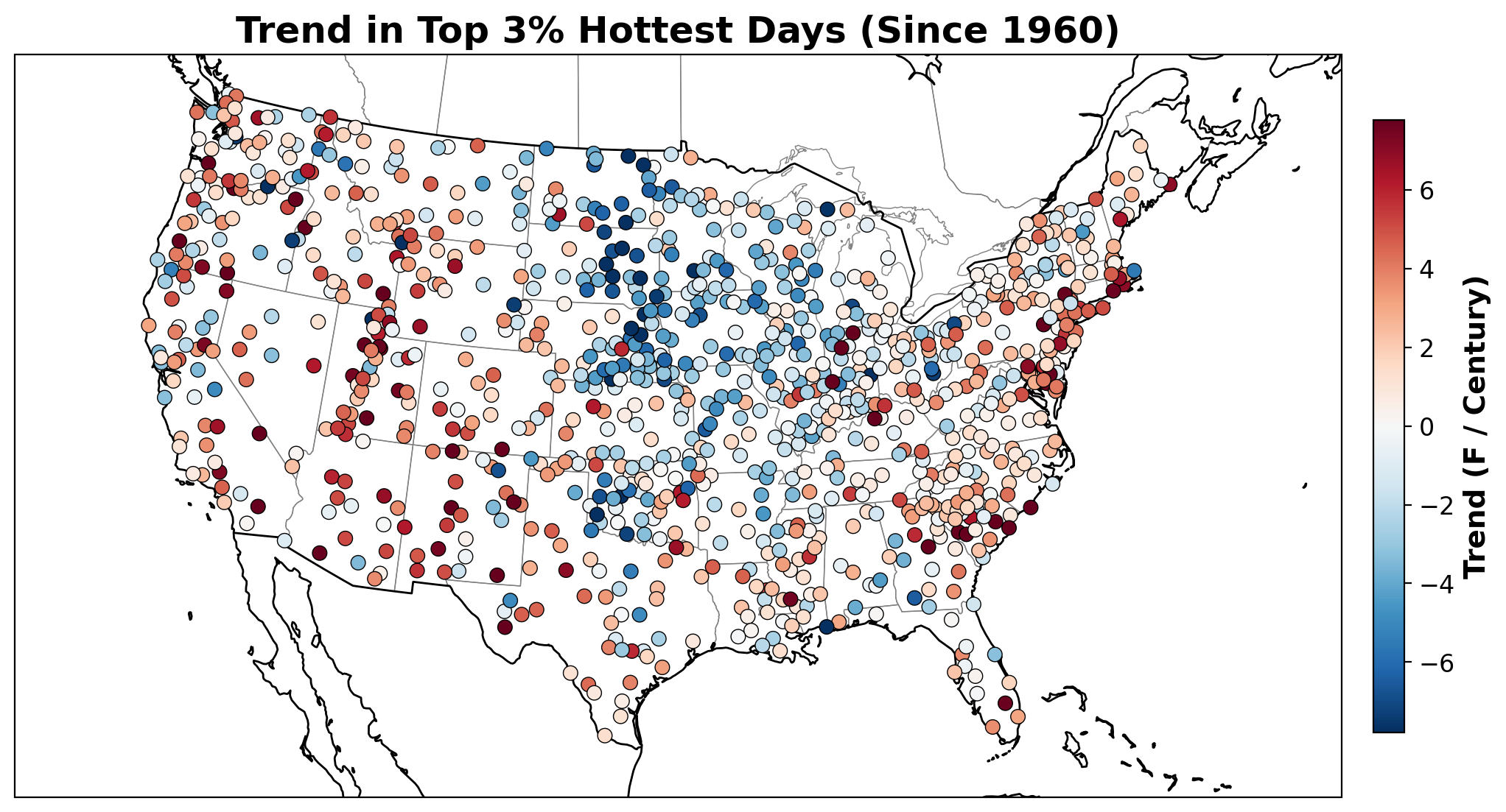
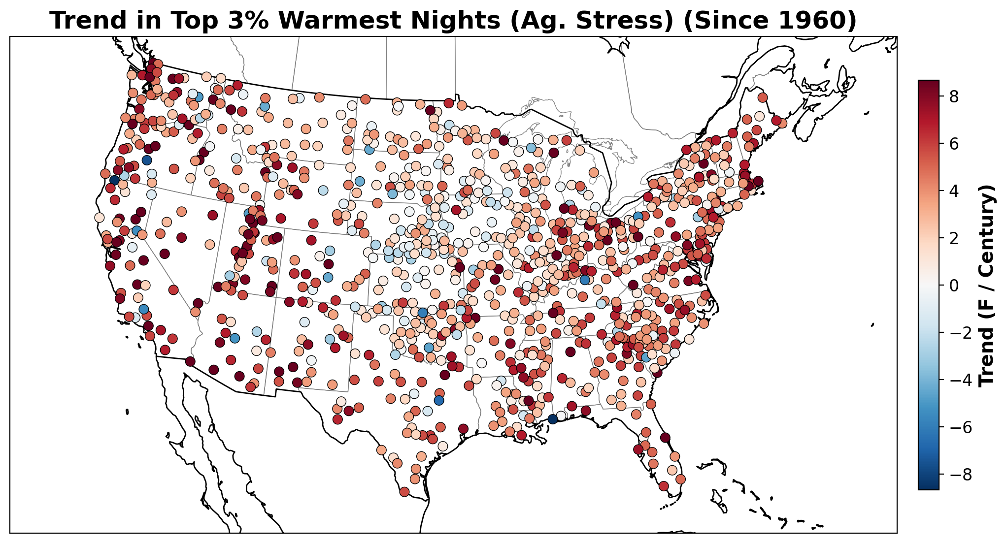
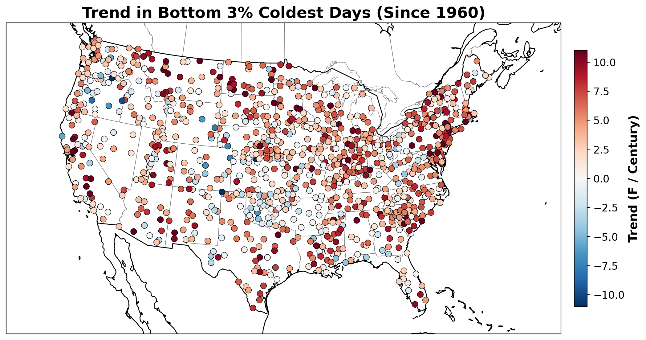
This dashboard tracks changes in the frequency and intensity of extreme temperatures across the United States. Rather than using an absolute temperature (like 95 F), these maps track the Top 3% and Bottom 3% of daily temperatures recorded at each individual weather station.
Using percentiles allows us to measure extremes relative to the local climate. The top 3% of summer days in Maine represents a very different temperature than the top 3% in Arizona, but this method allows us to see how the most extreme roughly 10 days and 10 nights of the year are trending for everyone.
How to read these maps: Across all four maps, RED indicates a warming trend. For the top row, red means the hottest days and nights are getting hotter. For the bottom row, red means the coldest days and nights are getting milder (less severely cold).
Trend in Hottest Days (Top 3% TMAX)
Trend in Warmest Nights (Top 3% TMIN)
Trend in Coldest Days (Bottom 3% TMAX)
Trend in Coldest Nights (Bottom 3% TMIN)
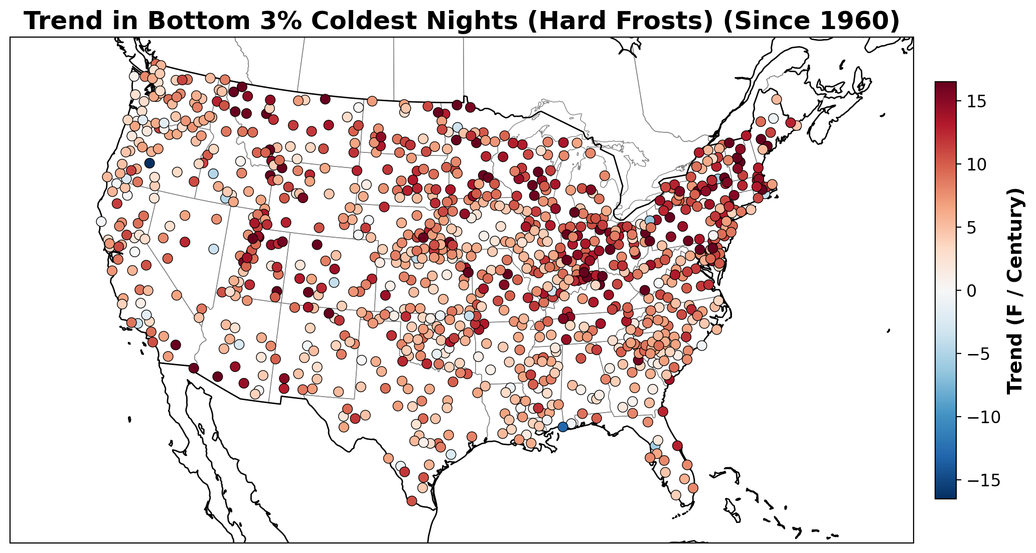
Note: You can view detailed 3-panel extreme plots for specific stations by navigating to your state or district from the Main Map. (Feature currently in Beta testing).
Copyright © 2026, CCT Team. All Rights Reserved.


